Showing posts with label Research and Planning. Show all posts

Wednesday, 9 March 2016

Production logos


This is a compilation of all three production logos that the members of my group and I drew as candidates for our company production logo. I will go through them one by one, analyse them and assess why or why not they were chosen for our opening.

The one to the right was my production logo. I created two basic yet professional looking production logos. My logo options were hand drawn by myself with pencil in an exercise book. My first logo was very basic; attempting to merge all the initials of our name into a simple logo, however my second one was more stylistic incorporating penguin footprints to accompany the production company name we decided on "Penguin Pictures". Though mine were quite good they lacked the striking, iconic nature of a production logo and would not catch the eye as well as a lot of other production logos.


The second logo, to the left of this text, was Kerry's logo. It was hand drawn, just like my own. Her first logo included neat abstract images that a lot of production companies opt for. while the second went for a more artistic approach with Kerry suggesting the animation of petals from a flower falling to form the logo. Despite Kerry's ideas being thoughtful and appropriate they were slightly to much to accomplish in such a short  period of time and we realised a simpler logo must be implemented. We also agreed that her logos held no relevance to our production company name and may confuse some people who saw a flower on a company named "Penguin Pictures".
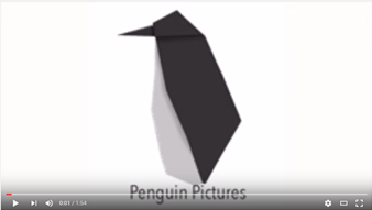
The final logo, Gavin's logo, was the one we eventually decided to use for our opening. This logo was made in Adobe Photoshop CS6 on a Mac. The idea for this logo was to be a simple and clean origami penguin. The image was simple enough to be created in a small amount of time yet was stylish enough to catch the eye. The penguin, which flips into form and then fades away, was perfect for our production company name(Penguin Pictures) and did not detract from the thriller opening itself by being too flashy yet earned merit in its own right by being quite nice on the eyes and matching the logo of a real production company.


Saturday, 27 February 2016

Evaluation of Rough Cut

Taking a step back and looking at our thriller opening from an analytical stance is essential in ensuring our piece gets better and better until we finally consider it finished. Just like any piece I'll analyse it in terms of editing, camera angles and sound. In this piece I'll be evaluating the 'Rough Cut' version of our opening.

In terms of camera angles, we ensured we used a variety of camera angles. It begins with a wide shot swinging into an over the shoulder shot. This shot is very effective at making the park look isolated and in turn making the man walking in it more mysterious. The close ups of the man being held captive do an excellent job of capturing the worried emotion of the hostage. The over the shoulder shot/high angle shot brilliantly captures both the fear on the hostage's face and translates the danger Joanna poses as an interrogator with the bat. The high angle nature of the shot even shows her clear power over him. Also, Joanna lowering herself to threateningly say, "Time's ticking", could both literally and metaphorically represent Joanna having to bring herself down to his level.


The lighting in the rough cut is relatively effective. Most of the scenes are very well lit, giving each shot the focus they should have. The outdoor shots look like natural daylight yet are low key enough to look somewhat sinister. The indoor shots make use of a spotlight on the hostage, clearly outlining the importance of him as a character, or the importance of the information he carries. The indoor scene also purposely omits using a backlight to make the location seem more cryptic and casts an ominous shadow on Joanna which makes her look a lot more threatening.


The sound in this rough cut, thought clearly not finished, is of average quality. In terms of diegetic sound, there are pieces of dialogue which add to the tense atmosphere. The decision to make the odd man in the suit speak in a foreign language makes him more mysterious and creates more questions in the viewers' minds. The non-diegetic sound in the rough cut consists of a eerie background track which really adds to the suspense and enigmatic theme in the opening.


Now, finally, in order to improve our rough cut to transform into a final product, we will make a few changes based on the evaluation too. Firstly we will add bars to the top and bottom of the opening throughout it to make it appear more professional. This technique is often applied in real films and it helped cut out some unfavourable background visuals in our opening. The title card of the film will also be changed as it looks very unprofessional and has no connection to the theme or narrative of the film whatsoever. The title cards will also be shortened as they linger too long and break up the pace of the opening. With them shorter viewers will be less bothered at having to look at names for a majority of the opening. With these changes, the opening will be more professional and reduce confusion amongst the audience.

Wednesday, 10 February 2016

Production logos

Production companies make films. Production companies have production logos. Since we are making a film, we must have one also. In this post I analyse some production logos in "the biz", as we "biz" people like to call it.


This production logo is from Grayscale, a small production company based in Pakistan. As the name connotes, the logo is designed completely in grayscale. Though this logo is well designed, as you can see with the cool looking gradients and scratchy-looking background adding to the grayscale effect, it is not really eye-catching. Grayscale are mostly associated with capturing raw and realistic photos and documentaries which make viewers feel the plight of the characters or people in the photos or film in question. Their relatively dull looking therefore matches the theme of the content they produce.


The next production company I will look at is Miramax Films. A much larger production company in terms of size and reputation. The company has produced hits such as Pulp Fiction, Good Will Hunting and Reservoir Dogs. The nature of the films aforementioned mirrors the style of the production logo created: big and bold. The Miramax logo is made to stand out despite being only black and white.


Now, lastly, an even bigger production company in terms of scale, reputation, wealth, pretty much everything. Paramount Pictures, included in the Big Six of production companies, have produced multiple box office success like Titanic, Forrest Gump and Star Trek. Their logo is much more colourful and eye-catching than the first two, making use of lush purples and blues to give a realistic and beautiful image, connoting their productions are of the same quality and beauty. The placement of the name of the company at the peak of the mountain also suggests that they are at the top of their game, or are above the rest. Even surrounding the name by stars to indicate that their pictures are star quality.

Sunday, 7 February 2016

Storyboard 2

Storyboard 2! I bet you didn't see that coming. Especially with the entirely different script that just went up... Enjoy!

Tuesday, 2 February 2016

Script (2nd draft)

As per usual, the first draft of anything is never perfect, and I doubt this one will be either but   we've done our best to improve upon the first one. This second draft includes more speech and action to build up atmosphere and tension. Enjoy at your own caution.


Sunday, 31 January 2016

Location Analysis

Getting the best setting for a film is important. Just like all the other things I said were important, yes. Ensuring the location matches the style of scene that is being filmed creates a more professional looking production and simply adds to the atmosphere of the film.
 

FIRST LOCATION: Drama Studio

For one of our planned shots we plan to have a dark room with excellent lighting and very few objects. Our drama room has that. It has a lights that we can artificially control, it has black curtains, very few objects to ruin the mise-en-scene and a prop closet where we can borrow some times for our props. The lights in the studio are also perfect or the scenes we want to shoot. It has spotlights which allows us to use lighting creatively, maybe lighting up one particular and spot ans also helping with making the background dark enough.


This a shot we took while messing around in the drama room. As you can see it has excellent lighting and quite good mise-en-scene due to the props available in this location.


SECOND LOCATION: Kelsey Park


For our second location we wanted somewhere open and not populated with too many people, we started looking at parks that didn't have too many people and decided that Kelsey park was the best for it's ease of access and for it's relative emptiness. The secluded nature of the park gave it the feel of a meet-up spot for something secretive.


 We thought this spot in particular would be a good spot to film a scene in, we thought it just looked... spyie.

Making the music

Music. Very important. Couldn't stress it enough. Good music can be the difference between a movie and a very good movie. This post goes through our music making and reasons why we made certain choices.


This was our first attempt to create the music which had taken quite a while to create. However when reviewing the song we realized it had a Sci-fi sound to it. This had limited the sound that we had created so we decided to change it. Despite this it did start off with a spy theme sound which created the right atmosphere for our thriller opening and allowed us match our footage. However it was very upbeat and this did not match the slow tempo of our thriller opening which also meant we had to change the speed and the sound of the song as well. 

The instruments that we had used was: House Amp Plucks, Silver Synth Saw and Strum Patterns, which is indicated in this picture down below.


These instruments had created the sound that we wanted by making the music fast pace and attention seeking. However we wanted music that was more sinister and suited out opening.We then changed the theme of song and came up with an piece of music that had included: French Horns, String Ensemble and Orchestral Kit which allowed us to create a piece that had a classic sound however still produced the sinister effect that we wanted.


This images show the music in progress. However we thought that it also needed a bass to add more of a dramatic effect to the piece as well as a sinister effect so that it draws the audience in. 

Possible fonts

The font of titles in a thriller can be instrumental in setting the tone of a film. Yes, simply the shape, style, weight and size of text in a film can tell a story or set an atmosphere, possibly even help distinguish a horror, from a thriller. In this post I will go through the fonts we had a look at and the subtext(yes, that was a pun) they may carry.
 
CONSIDERED FONTS

This font, alarming similar to the great 'SE7EN's title font, is not the type of font we are interested. Although it, uses a very worn, ruggish and urban style, that is not the type of font we are looking for when producing a stylish, sophisticated spy thriller.


This font, though closer to the style we are looking for, does not entirely capture the theme of our film. The font is a little too curly and styled. While it captures the professionalism of Joanna Reed it does not symbolise her straight-forwardness and clinical nature in her work.


This font is most likely the style of font we'll use as it both encases Joanna Reed's professional, sophisticated nature, yet her decisiveness and precision. It is particularly similar to the '007' style of font, especially since the film genre and main character are so alike.


OUR FONT
The font we eventually decided on was a a mix of the two right above and the first one we reviewed. An exceedingly simple yet professional font, representative of Joan's character and job description without the flair of Skyfall's font, to issue the idea that it is a more solemn film.

Monday, 25 January 2016

Target Audience Interviews

In order to gain more information on our target audience we had a couple interviews with some students who fit our target audience criteria. The first interview was with a 16 year old school student named Lorraine who likes thriller movies. This interview unfortunately had to be split into two parts due to audio issues.


Transcript:
Interviewer: Do you think thrillers should be funnier?
Lorraine: I don't think they should be funny; because some thrillers are based on real-life stories and sometimes that can affect and individual's life. Like just knowing that someone else has lived through all that suffering and pain, you just sitting there watching that, do you not feel some form of emotion, rather than just sitting there, laughing?


Transcript
Interviewer: What are you thoughts on spy thrillers?
Lorraine: I like spy thrillers because I like to see the new techniques they use in every type of film, because every spy thriller is different to the last one so I want to see what they use to bring up their game, in comparison to other competitors. I like to see spy thrillers because I like to see the action. I like to see the like effects they have on people and... yeah.


The second interview we had was with a 17 year old media student named Samuel who said he enjoys sitting down and seeing a good film in front of him.


Transcript
Interviewer: What kind of films do you like and why?
Samuel: Um, I like to see comedy films however my favourite are thriller films because I'm intrigued in the mystery that happen throughout them.
Interviewer: Okay, okay, what's your favourite thriller film?
Samuel: Um, my favourite thriller film is Transporter, and the reason why I like Transporter is because I'm intrigued, I like how the mystery is almost unclear so and I also like the characters and the action througout the movie as well
Interviewer: When do you think that thriller films are most effective?
Samuel: I think thriller films are most effective when most of the conventions such as low key lighting, mystery and all those other conventions are all used throughout the movie in order to get the best project out of it.
Interviewer: Thank you very much.

FEEDBACK RESULTS
The target audience interviews were a good way to get inside the mind of the audience to try and produce a film they would want to watch. With the help of the information they gave us, we were able to make certain decisions in our film making to increase the enjoyability for the viewers. For example, we made sure to steer clear of comic relief giving our film a slightly darker tone, separating it from an action film. We also made sure to create a mystery to keep the audience interested and included action with guns to excite the viewers too.