Showing posts with label Production. Show all posts
Showing posts with label Production. Show all posts
Sunday, 10 April 2016

Wednesday, 9 March 2016
Production logos

This is a compilation of all three production logos that the members of my group and I drew as candidates for our company production logo. I will go through them one by one, analyse them and assess why or why not they were chosen for our opening.
The one to the right was my production logo. I created two basic yet professional looking production logos. My logo options were hand drawn by myself with pencil in an exercise book. My first logo was very basic; attempting to merge all the initials of our name into a simple logo, however my second one was more stylistic incorporating penguin footprints to accompany the production company name we decided on "Penguin Pictures". Though mine were quite good they lacked the striking, iconic nature of a production logo and would not catch the eye as well as a lot of other production logos.
 The second logo, to the left of this text, was Kerry's logo. It was hand drawn, just like my own. Her first logo included neat abstract images that a lot of production companies opt for. while the second went for a more artistic approach with Kerry suggesting the animation of petals from a flower falling to form the logo. Despite Kerry's ideas being thoughtful and appropriate they were slightly to much to accomplish in such a short period of time and we realised a simpler logo must be implemented. We also agreed that her logos held no relevance to our production company name and may confuse some people who saw a flower on a company named "Penguin Pictures".
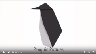
The final logo, Gavin's logo, was the one we eventually decided to use for our opening. This logo was made in Adobe Photoshop CS6 on a Mac. The idea for this logo was to be a simple and clean origami penguin. The image was simple enough to be created in a small amount of time yet was stylish enough to catch the eye. The penguin, which flips into form and then fades away, was perfect for our production company name(Penguin Pictures) and did not detract from the thriller opening itself by being too flashy yet earned merit in its own right by being quite nice on the eyes and matching the logo of a real production company.
Sunday, 6 March 2016
Edit decision list
While editing our opening there were many important decisions we made that we thought were necessary to make our thriller opening appear more professional, whilst maintaining a more cohesive narrative.
EDIT DECISIONS
EDIT DECISIONS
- Bars at the top and bottom of the screen
- Surprise cut at the bat swing
- Fades into titles
- Intercutting between the interrogation and Russian spy
- Saturation change on certain shot
- Distortion on the title card
Sunday, 21 February 2016
Rough Cut
A rough cut of our thriller opening. You're welcome. Constructive criticism is accepted :)
We need feedback! In order to improve our opening, if you could take this survey to give your thoughts on our opening, we would be very grateful. Thank you!
Create your own user feedback survey
We need feedback! In order to improve our opening, if you could take this survey to give your thoughts on our opening, we would be very grateful. Thank you!
Create your own user feedback survey
Sunday, 31 January 2016
Behind the scenes
Below are two videos simply showcasing some of the conversations that we had on set in order to get the shots we wanted, particularly in terms of lighting and camera angles. Ignore the horrible sound and listen to the sensible conversation :)
In that video, we were discussing the composition and intention of the shot. Gavin also mentions the order in which we filmed the shots, showcasing our attention to detail and planning. Gavin also goes over some notes with the actor to ensure the narrative of the opening was not misconstrued or confusing.
In that video, we were discussing the composition and intention of the shot. Gavin also mentions the order in which we filmed the shots, showcasing our attention to detail and planning. Gavin also goes over some notes with the actor to ensure the narrative of the opening was not misconstrued or confusing.
The second conversation shows me with another one of my group members discussing the bat scenes. We wanted to ensure the atmosphere for the scene was set to be dangerous, yet show the professionalism of Joan.
Making the music
Music. Very important. Couldn't stress it enough. Good music can be the difference between a movie and a very good movie. This post goes through our music making and reasons why we made certain choices.

This was our first attempt to create the music which had taken quite a
while to create. However when reviewing the song we realized it had a
Sci-fi sound to it. This had limited the sound that we had created so we
decided to change it. Despite this it did start off with a spy theme
sound which created the right atmosphere for our thriller opening and
allowed us match our footage. However it was very upbeat and this did
not match the slow tempo of our thriller opening which also meant we had
to change the speed and the sound of the song as well.
The instruments that we had used was: House Amp Plucks, Silver Synth Saw
and Strum Patterns, which is indicated in this picture down below.

These instruments had created the sound that we wanted by making the
music fast pace and attention seeking. However we wanted music that was
more sinister and suited out opening.We then changed the theme of song
and came up with an piece of music that had included: French Horns,
String Ensemble and Orchestral Kit which allowed us to create a piece
that had a classic sound however still produced the sinister effect that
we wanted.


This images show the music in progress. However we thought that it also needed a
bass to add more of a dramatic effect to the piece as well as a
sinister effect so that it draws the audience in.
Possible fonts
The font of titles in a thriller can be instrumental in setting the tone of a film. Yes, simply the shape, style, weight and size of text in a film can tell a story or set an atmosphere, possibly even help distinguish a horror, from a thriller. In this post I will go through the fonts we had a look at and the subtext(yes, that was a pun) they may carry.

This font, though closer to the style we are looking for, does not entirely capture the theme of our film. The font is a little too curly and styled. While it captures the professionalism of Joanna Reed it does not symbolise her straight-forwardness and clinical nature in her work.

This font is most likely the style of font we'll use as it both encases Joanna Reed's professional, sophisticated nature, yet her decisiveness and precision. It is particularly similar to the '007' style of font, especially since the film genre and main character are so alike.

 OUR FONT
The font we eventually decided on was a a mix of the two right above and the first one we reviewed. An exceedingly simple yet professional font, representative of Joan's character and job description without the flair of Skyfall's font, to issue the idea that it is a more solemn film.

CONSIDERED FONTS
This font, alarming similar to the great 'SE7EN's title font, is not the type of font we are interested. Although it, uses a very worn, ruggish and urban style, that is not the type of font we are looking for when producing a stylish, sophisticated spy thriller.

This font is most likely the style of font we'll use as it both encases Joanna Reed's professional, sophisticated nature, yet her decisiveness and precision. It is particularly similar to the '007' style of font, especially since the film genre and main character are so alike.


The font we eventually decided on was a a mix of the two right above and the first one we reviewed. An exceedingly simple yet professional font, representative of Joan's character and job description without the flair of Skyfall's font, to issue the idea that it is a more solemn film.
Filming on location
DRAMA STUDIO (ROUND 1)
Our main location for filming so far is the drama studio. We made use of the on site, spotlights for our lighting and also some of the props such as the chairs and table are also school property that we made use of. We decided to opt out of using multiple spotlights.The single spotlight here is particularly important as it creates the lighting effect we are aiming for, as it blocks out the background entirely by making use of only a keylight. This lighting creates a mysterious atmosphere as the viewers are unaware of the whereabouts of the characters, making them look suspicious, or at least making their activities seem shady. In terms of 'mise en scene', we used different kinds of glasses to differentiate between characters: a short glass for the more straight man, but rather a wine glass for the sophisticated and expereinced spy sitting in the middle. We also intended to use colour of ties to further contrast characteristics of the protagonist from her enemies, giving her a red tie while giving the other two black ties, to emphasise her ability to stand out of the crowd due to her high level skill. We chose however not to, because the nature of the camera angles rendered the colours unnoticeable at times and so did not feel very effective.
I wonder who threw those cards oh so nonchalantly... It was me, I threw them.
DRAMA STUDIO (ROUND 2)
The second time round we once again went for similar lighting, however this time opting for three lights to better create a more intimidating scene, yet maintain that sense of mystery. This time, we utilised less 'mise en scene' purposely rather than using it for effect, using the lack of it to emphasise the loneliness and desolateness of the hostage's location. Also the placement of the hostage right in the centre of the room with the spotlight placed on him also emphasises his importance and possibly the importance of the information he is holding.
(Revel in the awesomeness of that shot)
KELSEY PARK (COMING SOON)
The park was the perfect location to film the suspicious meeting of the Russian spy. We decided to film in the late afternoon and use natural lighting to ensure that it wasn't too dark but also looked low-key enough to seem sinister. The seemingly secluded location made it the Russian spy appear very mysterious rather than just a by-passer in a park. It also allowed us to make him look very isolated to the point where it suggests he maybe is even hiding. We did this by positioning him in the centre of the shot from a wide high angle. This ensured he was the focal point of the shot but seemed insignificant compared to the rest of the park. The lack of ambient sound in the park scenes also emphasise the lack of life in the environment and his loneliness.
Tuesday, 19 January 2016
Production Log
22/11/15 - Idea and concept were brainstormed and scriptwriting began.
29/11/15 - Final script was completed and filming was to begin the next day.
30/11/15 - The 3 possible filming locations for the first scene were assessed. For the first location it was decided that the lack of equipment made it difficult to use. The second location (small gym) was currently being occupied and so we resorted to the third location (drama studio). We managed to film in the third location (sixth form study room) but the lighting was poor and filming was postponed until the other locations were assessed and approved for filming.
29/11/15 - Final script was completed and filming was to begin the next day.
30/11/15 - The 3 possible filming locations for the first scene were assessed. For the first location it was decided that the lack of equipment made it difficult to use. The second location (small gym) was currently being occupied and so we resorted to the third location (drama studio). We managed to film in the third location (sixth form study room) but the lighting was poor and filming was postponed until the other locations were assessed and approved for filming.
09/12/15 - The third location, once again was being occupied and filming was postponed until the next day which was when it would be available.
10/12/15 - Location test in the drama studio was done to see if the lighting and sound were suitable. The results came out favourable and so the actual filming would be done on 14/12/15.
14/12/15 - All filming was done in the drama studio. The resulting footage came out well but more filming was to be done if the full opening was to be finished and editing would begin.
05/01/16 - Editing in the media suite began and the opening began to come out as we would have liked.
06/01/16 - Editing continued but footage fell short of expectations and more filming in multiple other locations was scheduled for the next two weeks.
11/01/16 - The title music was created for the opening ahead of the extra filming.
26/01/16 - Second round of filming began in the drama studio. Results produced were better the previous set of footage. The last day of filming would be done the next week on 01/02/16.
10/12/15 - Location test in the drama studio was done to see if the lighting and sound were suitable. The results came out favourable and so the actual filming would be done on 14/12/15.
14/12/15 - All filming was done in the drama studio. The resulting footage came out well but more filming was to be done if the full opening was to be finished and editing would begin.
05/01/16 - Editing in the media suite began and the opening began to come out as we would have liked.
06/01/16 - Editing continued but footage fell short of expectations and more filming in multiple other locations was scheduled for the next two weeks.
11/01/16 - The title music was created for the opening ahead of the extra filming.
26/01/16 - Second round of filming began in the drama studio. Results produced were better the previous set of footage. The last day of filming would be done the next week on 01/02/16.
Subscribe to:
Posts (Atom)