
This is a compilation of all three production logos that the members of my group and I drew as candidates for our company production logo. I will go through them one by one, analyse them and assess why or why not they were chosen for our opening.
The one to the right was my production logo. I created two basic yet professional looking production logos. My logo options were hand drawn by myself with pencil in an exercise book. My first logo was very basic; attempting to merge all the initials of our name into a simple logo, however my second one was more stylistic incorporating penguin footprints to accompany the production company name we decided on "Penguin Pictures". Though mine were quite good they lacked the striking, iconic nature of a production logo and would not catch the eye as well as a lot of other production logos.
 The second logo, to the left of this text, was Kerry's logo. It was hand drawn, just like my own. Her first logo included neat abstract images that a lot of production companies opt for. while the second went for a more artistic approach with Kerry suggesting the animation of petals from a flower falling to form the logo. Despite Kerry's ideas being thoughtful and appropriate they were slightly to much to accomplish in such a short period of time and we realised a simpler logo must be implemented. We also agreed that her logos held no relevance to our production company name and may confuse some people who saw a flower on a company named "Penguin Pictures".
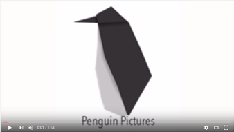
The final logo, Gavin's logo, was the one we eventually decided to use for our opening. This logo was made in Adobe Photoshop CS6 on a Mac. The idea for this logo was to be a simple and clean origami penguin. The image was simple enough to be created in a small amount of time yet was stylish enough to catch the eye. The penguin, which flips into form and then fades away, was perfect for our production company name(Penguin Pictures) and did not detract from the thriller opening itself by being too flashy yet earned merit in its own right by being quite nice on the eyes and matching the logo of a real production company.
No comments:
Post a Comment