In this, I will be comparing two different title sequences and showing how they use images and colour to introduce the audience to a film or show, sometimes without the viewers even noticing. The two title sequences I will be analysing will are from the Showtime drama Dexter, and romantic drama film, Blue Valentine.
DEXTER

The Dexter title sequence has a lot of iconography and contrasting images to get the point of who Dexter really is, through to the viewer.
1.

The image above shows the title card of the name of the show. The design of the title card itself is meant to reflect Dexter's character; the white background, pointing to Dexter's seemingly pure self, and the sinister, blotted, crimson text blemishing his outward, unadulterated appearance.
2.

This second frame displays Dexter wrapping string around his fingers, connoting the idea of strangling someone, when in fact Dexter is only flossing his teeth. This use of misdirection by the producer consistently used throughout the title sequence to confuse the viewer on how to feel about Dexter.
3.

This frame captures the Dexter violently cutting of an orange with a knife. However, is it really "violent",or are we just projecting what we believe to be true about Dexter, to make it feel more true? This is the effect that this frame is intended to have on the audience, to make them wonder whether they really trust this man, or whether they think he's a serial killer.
4.

In this image, we see Dexter, squeezing the juice out of a blood orange. With the name of the fruit itself being an oxymoron, as an 'orange' brings to mind a sweet, natural fruit while 'blood' being a sign of malevolent or criminal acts, the frame causes the viewer to realise Dexter may have more than one side to him.
5.
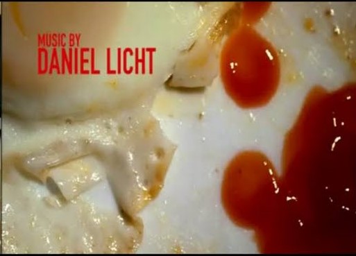
This fifth frame shows an extreme close up of Dexter's breakfast, which should appear innocent immediately seems evil when a blood-like liquid enters the shot, which though is only ketchup, still prompts the audience to believe something is not right about Dexter.
6.

In the final frame I'm analysing is a close up of Dexter's face, showing a very sinister look, straight at the camera. This here shows the use of low key lighting to make Dexter seem more dangerous and once again implant the idea that he is not what he seems. The use of the close up here also allows to try and understand the emotion on Dexter's face even better to help us decipher who he is.

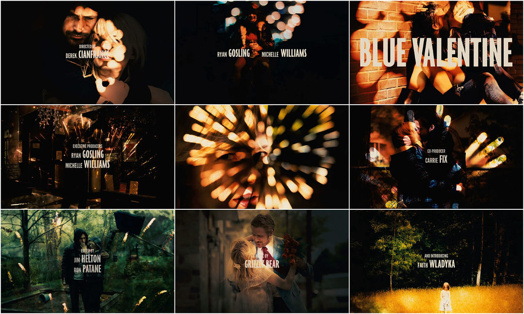
The Blue Valentine title sequence effectively also makes use of contrasting colours and images to get across the nature of the relationship of the two main characters.
1.

This image depicts a couple in close embrace, being surrounded by a wealth of darkness. The picture is also coming to life through a burst of light in the form of a firework. In the photo they seem like a happy couple, yet the black engulfing them could signal there is something darker in their relationship, similar to the dark themes in Dexter.
2.

This second frame has low key lighting, like some of the shots in the Dexter title sequence. this use of such dark lighting could signal that this seemingly happy couple, have had their fair share of unfortunate times. Even the scene that their set in is desolate and depressing, and instead of the fireworks possibly looking uplifting, it tends to add to the destructive look of the shot.
3.

This shot is a lot happier and makes use of much brighter lighting. The image is quite wide to encapsulate the state of joy in the photo. The sepia filter on the photos suggests that the pictures are old and were taken in the past, suggesting that this gleeful state that their in in this frame may not be the state of their relationship in the present.
4.

This fourth frame once again shows a firework erupting onto a photo, but what is being displayed in this photo is not clear. It is a close up of Michelle Williams, but her face emotion is not apparent. She does not seem, happy, or sad, rather indifferent, which is not particularly positive for a relationship. This lets the audience know once again, as in Dexter, not all is well with the protagonists.
5.

By this part of the title sequence we are familiar with the repetitive nature of a firework exploding onto a past picture of the couple, followed by a pitch black screen. This repeating effect could mirror the couple that we are observing's relationship, with the brief fireworks, beaming light onto pleasant times in their relationship. Yet since a majority of the title sequence us spent on a black screen, that would suggest that the majority of their relationship involved them enduring dark times. The explosive nature of the fireworks could even signify fights or arguments that they repeatedly engaged in.
6.

The last frame I will analyse is the last photo the erupts from firework is one of a girl standing alone in a field. The use of a wide shot here is to empahsise the girl's loneliness and let the viewers understand she has no one helping or guiding her. This image can be taken a number of ways: one could think it was the female in the relationship in the past, others could believe it to be the child of the couple. I rather agree, with the latter as it suggests to audiences that her parents, who from the title sequence, we could guess did not have the greatest marriage, have become so distant (to each other) that she now feels suck in the middle, and forsaken.
BLUE VALENTINE
The Blue Valentine title sequence effectively also makes use of contrasting colours and images to get across the nature of the relationship of the two main characters.
1.

This image depicts a couple in close embrace, being surrounded by a wealth of darkness. The picture is also coming to life through a burst of light in the form of a firework. In the photo they seem like a happy couple, yet the black engulfing them could signal there is something darker in their relationship, similar to the dark themes in Dexter.
2.

This second frame has low key lighting, like some of the shots in the Dexter title sequence. this use of such dark lighting could signal that this seemingly happy couple, have had their fair share of unfortunate times. Even the scene that their set in is desolate and depressing, and instead of the fireworks possibly looking uplifting, it tends to add to the destructive look of the shot.
3.

This shot is a lot happier and makes use of much brighter lighting. The image is quite wide to encapsulate the state of joy in the photo. The sepia filter on the photos suggests that the pictures are old and were taken in the past, suggesting that this gleeful state that their in in this frame may not be the state of their relationship in the present.
4.

This fourth frame once again shows a firework erupting onto a photo, but what is being displayed in this photo is not clear. It is a close up of Michelle Williams, but her face emotion is not apparent. She does not seem, happy, or sad, rather indifferent, which is not particularly positive for a relationship. This lets the audience know once again, as in Dexter, not all is well with the protagonists.
5.

By this part of the title sequence we are familiar with the repetitive nature of a firework exploding onto a past picture of the couple, followed by a pitch black screen. This repeating effect could mirror the couple that we are observing's relationship, with the brief fireworks, beaming light onto pleasant times in their relationship. Yet since a majority of the title sequence us spent on a black screen, that would suggest that the majority of their relationship involved them enduring dark times. The explosive nature of the fireworks could even signify fights or arguments that they repeatedly engaged in.
6.

The last frame I will analyse is the last photo the erupts from firework is one of a girl standing alone in a field. The use of a wide shot here is to empahsise the girl's loneliness and let the viewers understand she has no one helping or guiding her. This image can be taken a number of ways: one could think it was the female in the relationship in the past, others could believe it to be the child of the couple. I rather agree, with the latter as it suggests to audiences that her parents, who from the title sequence, we could guess did not have the greatest marriage, have become so distant (to each other) that she now feels suck in the middle, and forsaken.
No comments:
Post a Comment