This presentation was made with an online presentation software named Slides. It was a slightly different presentation system which allowed me to create a deck of slides rather than slides themselves allowing you to rearrange your deck(slides) in any way you want. This software was very useful as it had a sleek yet easy-to-use interface.
Wednesday, 30 March 2016
Monday, 28 March 2016
Question 1: ‘In what ways does your media product use, develop or challenge forms and conventions of real media products?’
This question was made with Microsoft Word but was then uploaded onto SlideShare to make it compatible to be shared on Blogger. Microsoft Word's simple, down-to-earth word processing features made typing my evaluation quite easy while its light photo editing features allowed me to put together a neat 9 block image of both openings I was assessing. SlideShare also made the file much easier to explore once uploaded as it keeps everything in one place and doesn't allow editing of text.
Wednesday, 9 March 2016
Production logos

This is a compilation of all three production logos that the members of my group and I drew as candidates for our company production logo. I will go through them one by one, analyse them and assess why or why not they were chosen for our opening.
The one to the right was my production logo. I created two basic yet professional looking production logos. My logo options were hand drawn by myself with pencil in an exercise book. My first logo was very basic; attempting to merge all the initials of our name into a simple logo, however my second one was more stylistic incorporating penguin footprints to accompany the production company name we decided on "Penguin Pictures". Though mine were quite good they lacked the striking, iconic nature of a production logo and would not catch the eye as well as a lot of other production logos.
 The second logo, to the left of this text, was Kerry's logo. It was hand drawn, just like my own. Her first logo included neat abstract images that a lot of production companies opt for. while the second went for a more artistic approach with Kerry suggesting the animation of petals from a flower falling to form the logo. Despite Kerry's ideas being thoughtful and appropriate they were slightly to much to accomplish in such a short period of time and we realised a simpler logo must be implemented. We also agreed that her logos held no relevance to our production company name and may confuse some people who saw a flower on a company named "Penguin Pictures".
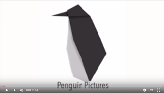
The final logo, Gavin's logo, was the one we eventually decided to use for our opening. This logo was made in Adobe Photoshop CS6 on a Mac. The idea for this logo was to be a simple and clean origami penguin. The image was simple enough to be created in a small amount of time yet was stylish enough to catch the eye. The penguin, which flips into form and then fades away, was perfect for our production company name(Penguin Pictures) and did not detract from the thriller opening itself by being too flashy yet earned merit in its own right by being quite nice on the eyes and matching the logo of a real production company.
Sunday, 6 March 2016
Edit decision list
While editing our opening there were many important decisions we made that we thought were necessary to make our thriller opening appear more professional, whilst maintaining a more cohesive narrative.
EDIT DECISIONS
EDIT DECISIONS
- Bars at the top and bottom of the screen
- Surprise cut at the bat swing
- Fades into titles
- Intercutting between the interrogation and Russian spy
- Saturation change on certain shot
- Distortion on the title card
Friday, 4 March 2016
Response/reaction to feedback from target audience
The feedback on our rough cut allowed us to make some changes that were definitely needed to make our opening more professional and also better in terms of quality.
One of the criticisms was that the clouds at the end did not match the theme or title and had no relevance to everything that had occurred before. Another issue some members of our target audience had, was that they felt the title of the film had no relation to what had occurred and they were confused as to who Joan Riede was and what the diamonds were. In response to this feedback we decided to change the name of the film to 'Torment' as it relates to the torture throughout the opening. We also removed the clouds and changed the title font and colour to a deep blue. It now gives off a more spy type feel and has been animated to suit that style also. The clouds were replaced with a pitch black screen which though seems boring, really nails the solemn tone in the film.
Another issue some people had with the film was that the title cards were not very coherent (using 'Starring', then 'Co-starring' and then 'Starring' again) and it made the opening look somewhat unprofessional. We have altered the titles, simply to names, which is much more modern and professional method of doing credits for cast and crew.
Some people were all very unclear with what the Russian spy and were not sure about his relevance to the narrative. The feedback collected suggested that if we added subtitles to the Russian spoken parts, it would help to understand his importance and also to help follow the story. We agreed with this idea and decided to change it accordingly.
Wednesday, 2 March 2016
Feedback from target audience
In order to improve our opening we had to receive feedback from our target audience. So we set up a poll on SurveyMonkey and were able to collect responses for analysis. Some questions were just general asking if they enjoyed certain features such as lighting or professionalism while others were more specific pinpointing what emotions they may have felt to ensure our opening was having the intended effect of the audience.

For the first question, people tended to overall enjoy the opening, resulting in an average score of 4.33 out of 5. This question does not show much but proves the professionalism and quality of our opening. It also shows we targeted the right audience for our opening.

The second question was a much more open one. Here are a few of the responses. With this question we were trying to get feedback on what the viewers enjoyed and what not to alter. The feedback on certain parts that the audience liked was helping in applying what they enjoyed in other areas of the opening. For example, a particular person liked the use of the enigma code and so we tied to keep that consistent throughout the opening.

The third question was to ensure that the audience would understand the narrative of the opening and whether it was coherent. We received very positive feedback on this particular question with all survey fillers giving a positive answer ensuring us not to change or worry about the narrative.

The fourth question was to assess our titles and whether they looked professional and suited the theme of the opening. The feedback from this overall was quite positive and only a couple changes were made to the titles to make them shorter and more coherent.

The fifth question of the survey inquired about the music of the opening and whether it matched the overall atmosphere of the opening of the and the theme of thrillers. It would help determine how much the music would need to be changed or even replaced entirely. The response for this was overwhelming positive receiving an 100% "Yes" rate and so the music was not altered.


The seventh question was another open question regarding any emotions or feelings the viewer may have had while watching the opening. This question was in the survey to monitor the emotions that our viewers we experiencing and whether our opening had the effect we intended on the audience. From the response it suggests that it did, they were " engaged, felt "surprise" and "fear" and also empathised with the hostage.

The last question was regarding the professionalism of our opening. Ensuring our opening resembled a actual thriller was vital. The response to this question was very positive, achieving a 4.67 out of 5 average. Despite this high mark we still made some changes to improve the professionalism of this opening.
For feedback we also allowed viewers to comment on our posts which allowed us to get direct feedback on what our audience thought. This is an example of a comment we received from a member of the target audience. Though it seems she immensely enjoyed the opening, she still outlined a lot of issues she had with it like a lack of subtitles, the clouds at the end and odd titles.

This was how we collected feedback from our audience, if you would like more information in greater detail on how we altered our opening based on these changes, a post named Response to Target Audience feedback will be uploaded soon.
Subscribe to:
Comments (Atom)